Описание файла
Бесплатно для зарегистрированных пользователей, членов Клуба и ВИП-членов.
7 Navigational Implementations that Make Kohl’s Best-in-Class
After usability testing 19 leading e-commerce sites and subsequently benchmarking 50 major ecommerce sites (twice) on Homepage & Category UX performance, and finally analyzing the 7,900+ manually reviewed UX parameters in that benchmark database, we find that:
- The average e-commerce site has an overall good Homepage & Category User Experience, with the average UX performance having increased by 39% since 2013.
- However, despite the good overall performance, if we dive deeper into the subcomponents of a good navigation experience, we find that many missed opportunities – for instance, 54% of e-commerce sites suffer from “over-categorization.” This is a severe issue that has been observed to heavily impede users’ ability to effectively navigate product categories.
- Another severe issue is that 22% of major e-commerce sites lack Intermediary Category Pages at the very top of their category hierarchy – despite these consistently showing to improve users’ ability to reliably navigate the product catalog.
While several sites perform well, a few stand out as performing exceptionally well, in particular within these three areas. One such site is Kohl’s, which ranks #5 in our just-updated Homepage and Category UX benchmark.
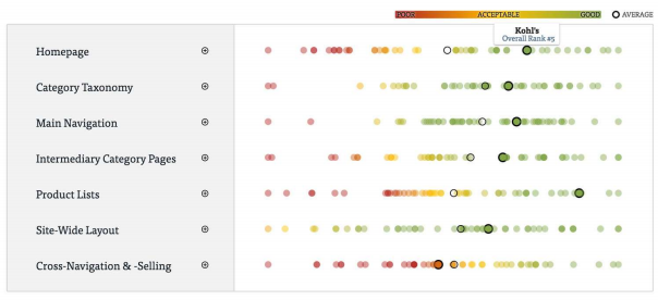
Kohl’s UX performance across 7 core sub-elements of the homepage and category navigational experience, plotted against 49 other top-grossing e-commerce sites. The scores/dots for the 7 sub-elements are the summarized score of a total of 3,950 usability scores manually set by Baymard. (Tip: you can also browse a free interactive version of this scatterplot.)
It’s clear that Kohl’s overall great category UX performance comes from having a well-rounded site that performs great within almost all sub-areas of the navigational experience – unlike most sites, there’s only a single area (Cross-Navigation & Selling) where they have actual performance issues (more on that at the end of this article).
In this article we’ll explore 7 specific navigational UX implementations at Kohl’s. These navigational implementations not only make Kohl’s perform great but are implementations that our large-scale usability testing verified to be high-performingnavigational designs that can be applied to most e-commerce sites – and should therefore be highly relevant examples for most.
ВНИМАНИЕ!
Полностью статья изложена в PDF-файле, который доступен бесплатно для зарегистрированных пользователей, членов и ВИП-членов Клуба Знаний Мебельного Бизнеса.
Если Вы ещё не зарегистрированы у нас на площадке, сделайте это сейчас здесь - займет всего 1 мин.
Вам также станут бесплатно доступны более 2000 материалов по маркетингу, мерчандайзингу, управлению, продажам, должностные инструкции, фото, видео.
Жалоба


